

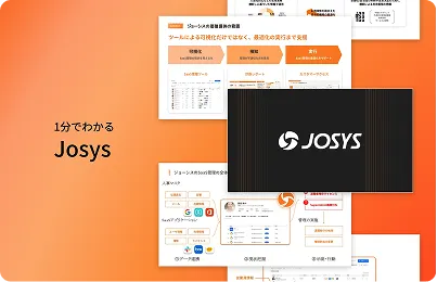
Josys Reveals New Brand Identity as Global Expansion Accelerates
Join hundreds of companies and start your identity governance journey today
.png)
Alongside today’s press release announcing our new access governance toolkit, Josys is excited to introduce a modernized brand identity that reinforces our bold ambitions to develop the leading SaaS Management platform in the world.
The brand update includes a reimagining of the corporate logo that features a dynamic, gradient-splashed icon to symbolize the forward-looking and action-oriented approach the company is recognized for in the emerging SaaS Management category. Similarly, the refreshed wordmark features italicized, all caps typography to symbolize the brand’s commitment to breakthrough innovation and pushing the boundaries of what’s possible in the industry.

The wordmark also pays homage to the company’s heritage by incorporating similar weightings and curvatures of the Japanese characters featured in the original Josys logo.
Additionally, the visual identity integrates an expanded color palette, new typography, and creative graphical elements that compliment the brand’s progressive positioning. The curved line imagery that is now present throughout the brand’s visual catalog ties back to Josys’ recognition as the only SaaS Management platform in the industry that delivers true 360o control.


In addition to these new brand elements, Josys is also excited to launch its new unified web presence that consolidates its Japanese and English sites into a singular entity to better meet the needs of global visitors looking to learn more about the company’s platform. This new experience delivers immersive digital content and a consistent user journey for visitors across the globe.
As Josys has embarked on an accelerated global expansion over the past 18 months, we are proud to firmly ground our business and brand in a unified visual identity that will best represent our company going forward and help propel us into the future. We are thrilled to finally be able to share this work more broadly and invite you to join us on this journey as we continue on our path as the fastest growing startup in Japanese history.
over your identities, applications, and files?
Sign-up for a 14-day free trial and transform your IT operations.


Questions? Answers.


What is Josys?

End-to-End Identity
Governance made easy for IT


